
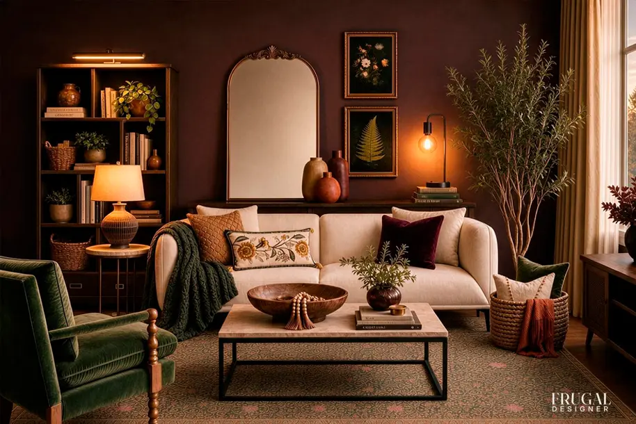
Fall decorating doesn't have to mean adding pumpkins, plaid, and piles of seasonal decor. We built this living room around a richer kind of cozy—deep burgundy, earthy olive, warm wood, vintage-inspired accents, and plenty of texture.
The best part? Almost nothing here is actually fall decor. These are pieces and colors that can live in your room year-round, but together they create that warm, layered feeling we start craving when the days get shorter.
Below, we're breaking down the room piece by piece—the palette, furniture, textures, lighting, and finishing touches—so you can borrow the whole look or just the parts that work for your space and budget.
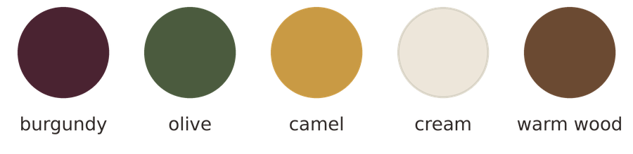
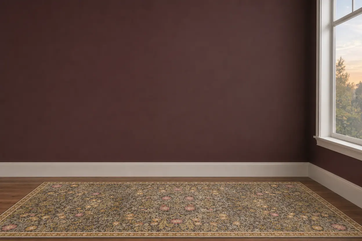
We started by setting the mood with deep burgundy walls. It’s a bold color, but the warm red-brown undertones make it surprisingly easy to live with—and give the room that cozy, enveloping feeling we were after without relying on anything overtly seasonal.
With that much color on the walls, we kept the floor lighter. The vintage-inspired rug has a soft neutral base with muted olive, gold and burgundy woven through the pattern. Those subtle repeats help connect the colors we’ll add later while giving the room a lighter foundation to balance the dark walls.
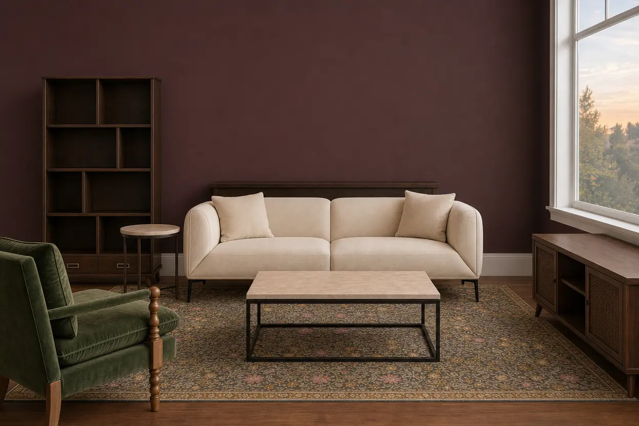
With the room's foundation in place, we added the largest furniture pieces: a cream sofa, olive green chair, coffee table and dark wood storage.
The light sofa creates contrast against the burgundy walls and keeps the center of the room from feeling too heavy. The olive chair introduces the room's main secondary color, while its velvet upholstery and turned wood frame add a little vintage character. Rather than matching the sofa, it looks like a piece that could have been collected over time.
We kept the tables and storage pieces in warm-to-dark wood tones. Against the deeper wall color, they visually recede instead of competing with the upholstery, while giving us plenty of places to layer in lighter accessories later.
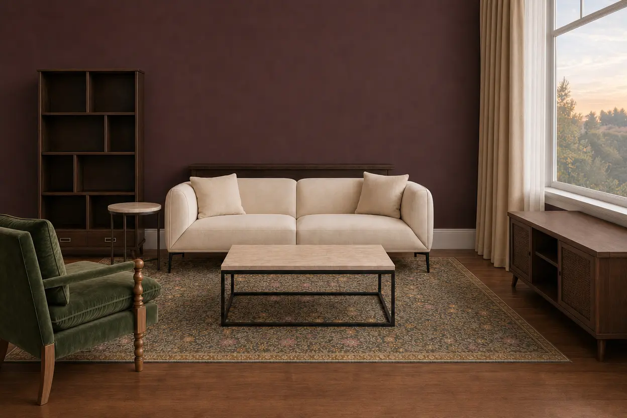
The room already has plenty of color, so we kept the windows quiet. Simple cream curtain panels soften the space and repeat the lighter tones of the sofa and rug without introducing another color or pattern.
We hung the curtains high and wide so they frame the window rather than covering it. That makes the window appear larger and, more importantly in a room with dark walls, lets in as much natural light as possible.
The soft fabric also adds another layer of texture and helps balance all the harder surfaces in the room—wood furniture, glass, metal and framed art.
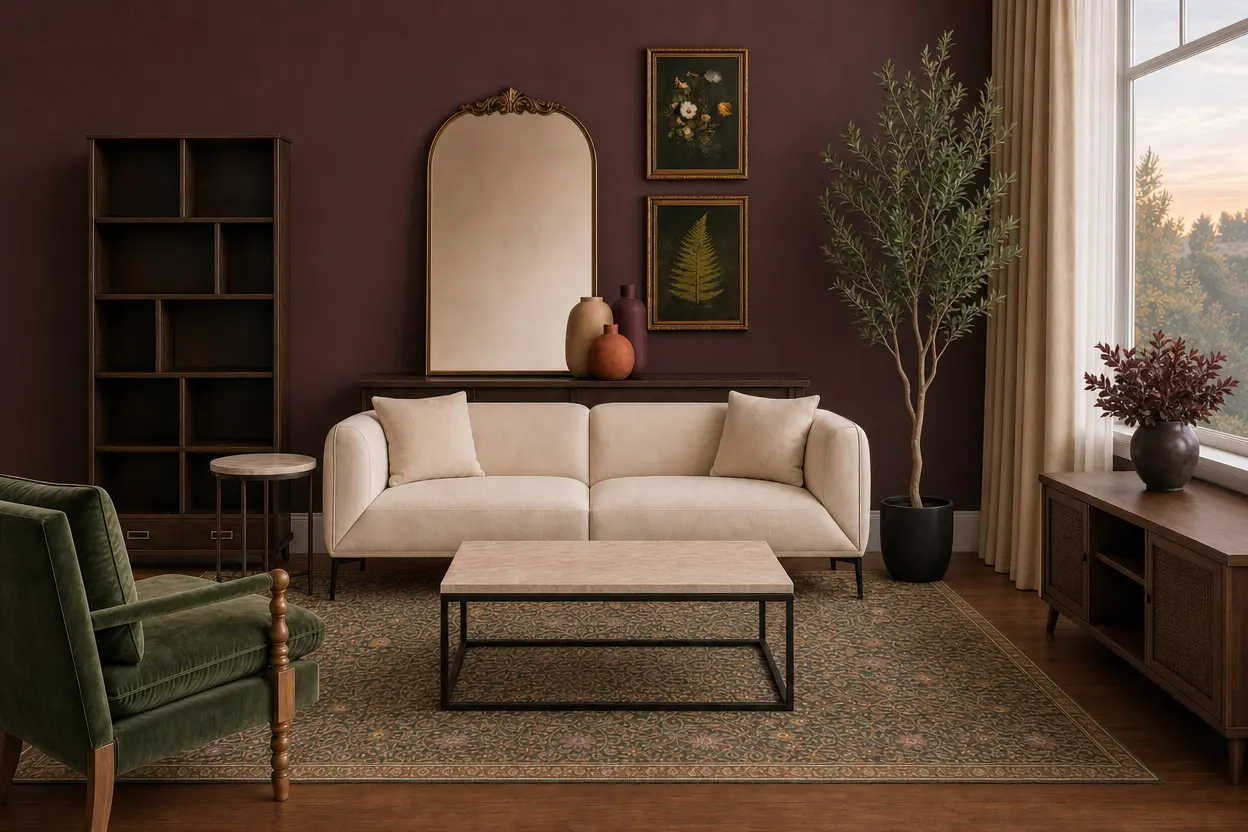
This is where the room starts to feel collected rather than simply furnished.
We mixed a large vintage-inspired mirror with botanical artwork instead of filling the wall with one matching set. The oversized mirror breaks up the burgundy wall and reflects some of the room's natural and artificial light, while the smaller botanical prints bring the olive, cream and warm gold tones from the rest of the room up onto the walls.
The pottery works the same way. Burgundy, terracotta and warm neutral vases repeat colors already in the palette, but their different shapes and finishes keep the grouping from feeling too coordinated. Greenery adds height and another hit of olive without introducing a new color.
The goal isn't symmetry or perfect matching. Repeating colors and materials is what lets a mix of different objects feel like they belong together.
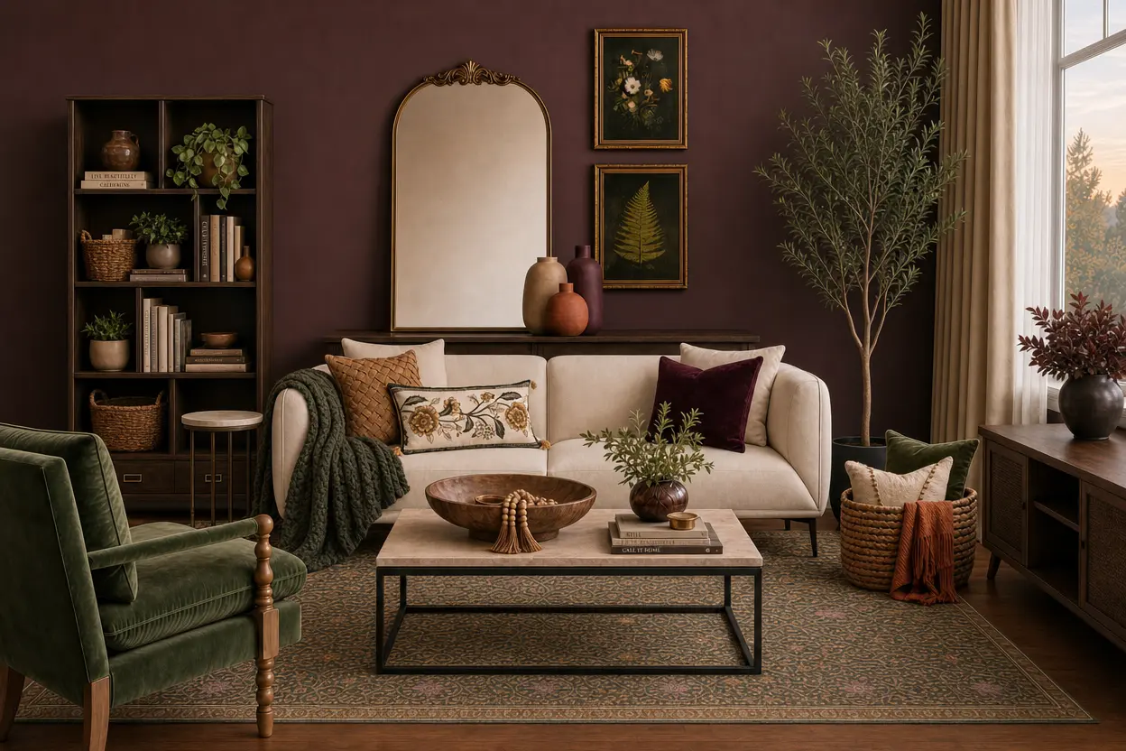
Now comes the easiest layer to change—and usually the least expensive.
We pulled olive green across the room with the chunky throw and pillows, then added camel, burgundy and botanical pattern in smaller doses. Because those colors already appear elsewhere in the room, the accessories make everything feel more connected rather than introducing something new.
Texture matters just as much as color here. Velvet, chunky knit, woven fibers and soft textiles give the room the tactile layers that make it feel cozy. A wood bowl, baskets, books and a few smaller objects fill in the harder surfaces without covering every available inch.
This is also where restraint helps. Leave some empty space around your accessories so the pieces you do use have room to register.
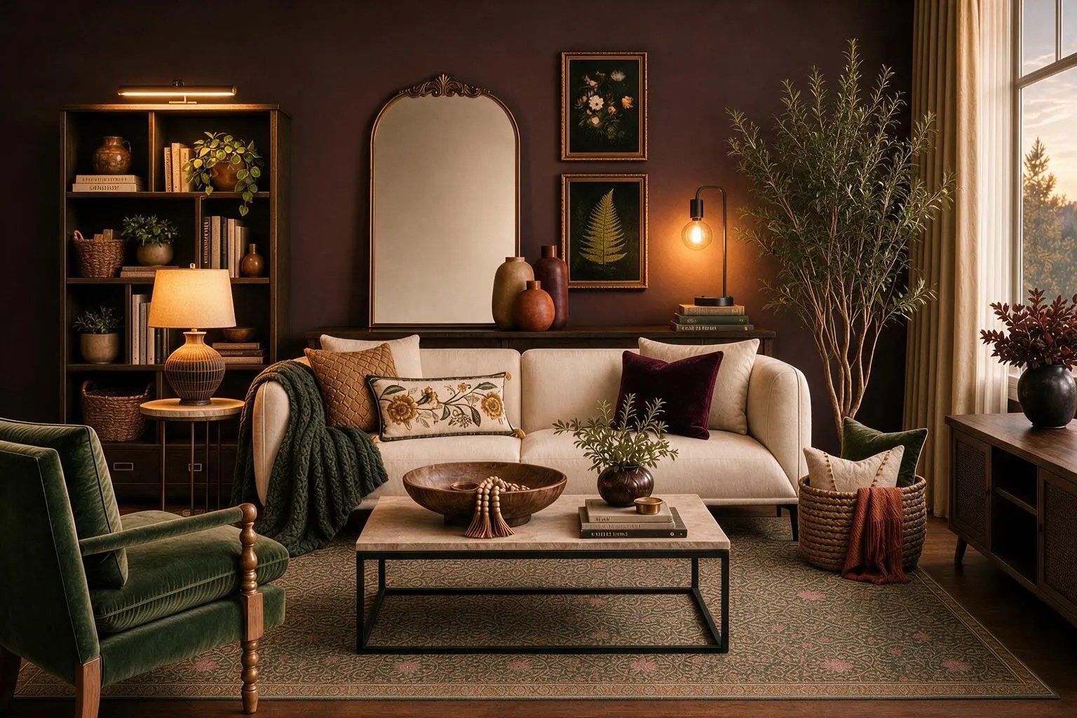
Lighting is the final ingredient—and in a room this moody, it's an important one.
Rather than relying on a single overhead fixture, we spread smaller pools of warm light around the room. The table lamp brightens the darker corner by the bookcase, while the small accent lamp near the artwork adds a softer glow and draws attention to that side of the room.
The warm bulbs also bring out the red undertones in the burgundy walls and make the wood, camel and cream tones feel richer. During the day, the large window does most of the work; as the natural light fades, the lamps take over without changing the mood of the room.
The best part of fall decorating is making home feel a little warmer, softer and more inviting. Here, rich burgundy walls set the mood, while olive green, warm woods, layered textiles and vintage-inspired botanicals bring in the colors and textures of the season.
It’s cozy, a little moody and unmistakably fall—without a pumpkin in sight.
Frugal Designer participates in affiliate marketing programs and may earn commissions from qualifying purchases made through affiliate links.
As an Amazon Associate, we may earn commissions from qualifying purchases from Amazon.com.